
Most growers glance at a PPFD map, see a number in the 800s at the centre, and assume that’s what their whole canopy is getting. It isn’t. The centre number is almost always the best-case reading — and everything from there to the edge of your grow space drops off, sometimes dramatically. Understanding why that drop happens, what the gradient means for your specific crops, and how to use that data to make smarter setup decisions is what separates growers who optimise their yields from those who wonder why the plants near the edges never quite keep up.
A PPFD map is one of the most useful pieces of data a grow light manufacturer can provide — and one of the most commonly misread, manipulated, or ignored. At Grow With Hydroponics, the Grow Light Calculator generates real physics-based 9×9 PPFD grids for any fixture setup, using the same cosine irradiance and wall-reflection models that commercial horticulture labs use. This guide explains exactly how to read that grid, what each zone means for plant performance, what good uniformity looks like versus bad, and how to act on the data to improve every grow.
Quick Answer — What Is a PPFD Map and How Do You Read It?
A PPFD map is a grid of light intensity readings (measured in µmol/m²/s) taken across a canopy area at a specific fixture height, showing how light is distributed across the entire grow space — not just the centre. To read one: check the average PPFD against your crop target, compare the minimum to the average to calculate the uniformity ratio (min ÷ avg), and identify which zones are under- or over-lit for your specific plants. A uniformity ratio above 0.75 (75%) is the industry standard for acceptable coverage. Below that, expect uneven growth.
What Is a PPFD Map and Why Does It Exist?
A PPFD map is a spatial distribution chart showing Photosynthetic Photon Flux Density values at multiple points across a defined canopy area, measured at a specific fixture height. Each cell in the grid represents the actual µmol/m²/s landing on that square of canopy.
It exists because a single peak PPFD number—the figure most commonly displayed in grow light marketing — tells you almost nothing about real-world coverage. A fixture might hit 1,200 µmol/m²/s dead centre and drop to 80 µmol/m²/s in the corners of the same 4×4 foot area. Both numbers are technically accurate. The map shows you the full picture.
Why Single-Point PPFD Claims Are Misleading
Many horticultural lighting brands provide manipulated or misleading PPFD maps with inflated readings that don’t reflect real-world conditions — using incorrect testing point grids, testing with reflective walls to artificially boost values, or only displaying maximum PPFD readings without showing true distribution. Even well-intentioned single-centre readings are structurally incomplete. They’re the best number, measured at the best point, under often ideal conditions. Your plants at the edges aren’t living in that number.
A useful PPFD map should disclose all measurement metadata: test height, grid density and spacing, mapped area size, and the resulting average, minimum, and maximum values. Without that, you can’t compare maps from different vendors or setups.
How to Read a 9×9 PPFD Map: A Real Reference Example
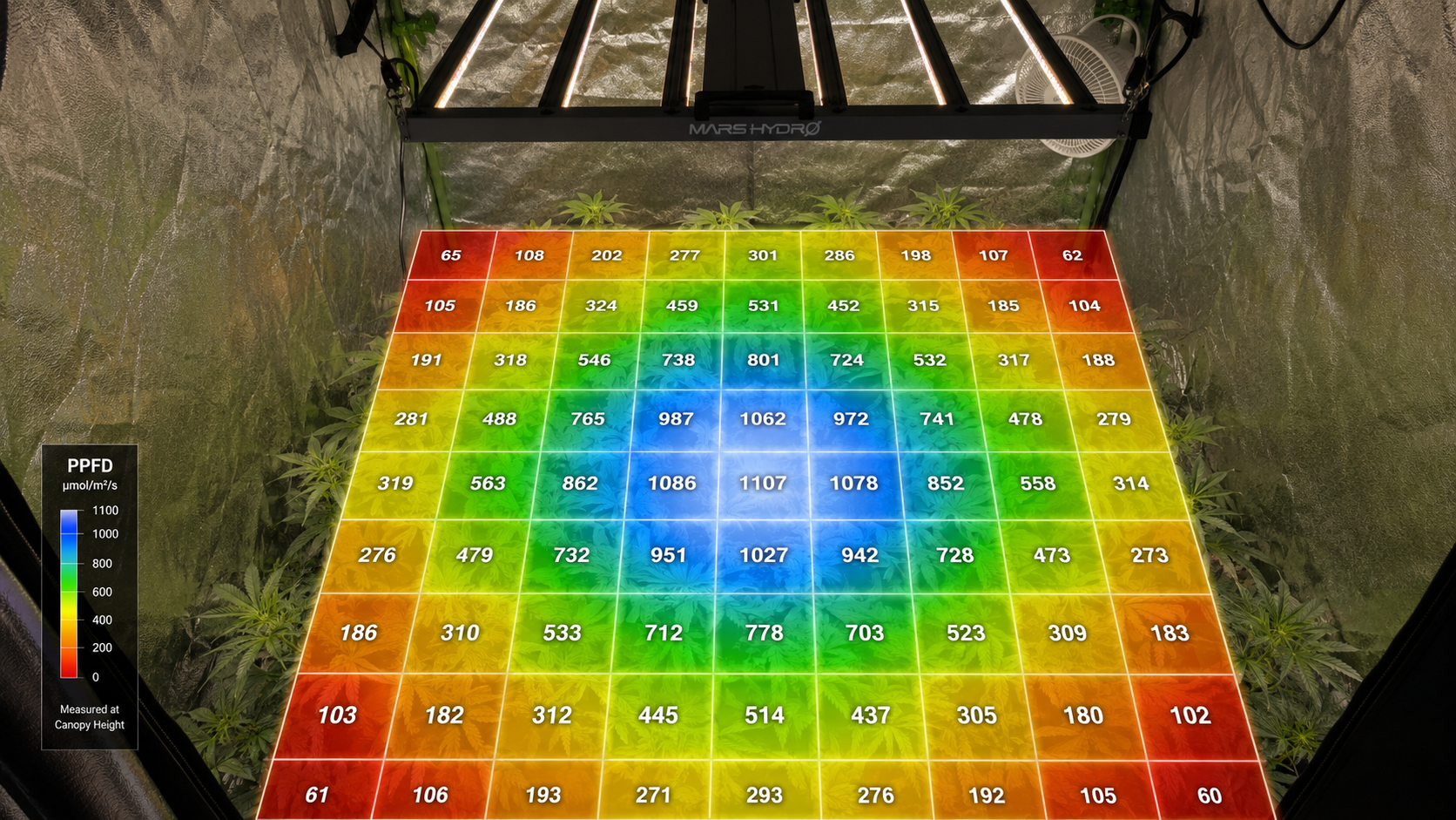
The most detailed format for a PPFD map is a 9×9 grid — 81 measurement points across the canopy. This is the format used by the Grow Light Calculator at Grow With Hydroponics, built on a physics-based cosine irradiance model with ASABE S640-compliant uniformity scoring.
Here’s a reference grid generated using a realistic setup: 400W LED bar fixture, 2.8 µmol/J efficiency, 18-inch mounting height, 4×4ft canopy, Mylar walls (97% reflectance).
Reference 9×9 PPFD Grid — 400W Bar LED at 18 Inches
| C1 | C2 | C3 | C4 | C5 | C6 | C7 | C8 | C9 | |
|---|---|---|---|---|---|---|---|---|---|
| R1 | 60 | 82 | 102 | 115 | 120 | 115 | 102 | 82 | 60 |
| R2 | 113 | 165 | 211 | 241 | 251 | 241 | 211 | 165 | 113 |
| R3 | 208 | 326 | 431 | 493 | 513 | 493 | 431 | 326 | 208 |
| R4 | 335 | 564 | 762 | 871 | 903 | 871 | 762 | 564 | 335 |
| R5 | 404 | 702 | 958 | 1093 | 1131 | 1093 | 958 | 702 | 404 |
| R6 | 335 | 564 | 762 | 871 | 903 | 871 | 762 | 564 | 335 |
| R7 | 208 | 326 | 431 | 493 | 513 | 493 | 431 | 326 | 208 |
| R8 | 113 | 165 | 211 | 241 | 251 | 241 | 211 | 165 | 113 |
| R9 | 60 | 82 | 102 | 115 | 120 | 115 | 102 | 82 | 60 |
Values in µmol/m²/s. Row 1 = back edge. Row 9 = front edge. Column 1 = left edge. Column 5 = centre.
Grid Statistics:
- Average PPFD: 387 µmol/m²/s
- Peak PPFD (centre): 1,131 µmol/m²/s
- Corner PPFD (min): 60 µmol/m²/s
- Uniformity ratio (Min/Avg): 0.155 (15.5%)
- ASABE S640 threshold (>0.75): ❌ FAIL
That uniformity number looks alarming. But before you panic — this is a normal result for a single bar fixture over a full 4×4 foot area at 18 inches. The physics of how light spreads is working exactly as expected. What matters is knowing how to interpret each zone correctly.
PPFD Map Zones: What Each Region Means for Your Crops
Not every zone of a PPFD map has the same implications. The key is matching what each zone delivers against what each crop or growth stage actually needs.
Zone Colour Key
| PPFD Range (µmol/m²/s) | Zone | Crop Match |
|---|---|---|
| < 150 | 🔴 Critically Low | Germination, seedlings only |
| 150–300 | 🟠 Low | Lettuce, spinach, microgreens |
| 300–600 | 🟡 Moderate | Herbs, leafy greens at full production, tomato/pepper veg stage |
| 600–900 | 🟢 Target Zone | Fruiting crops in flower, high-yield herbs |
| 900–1,200 | 🔵 High | Fruiting stage with strong root system; monitor for light stress |
| > 1,200 | ⚪ Excess | Risk of photoinhibition unless CO₂ is elevated |
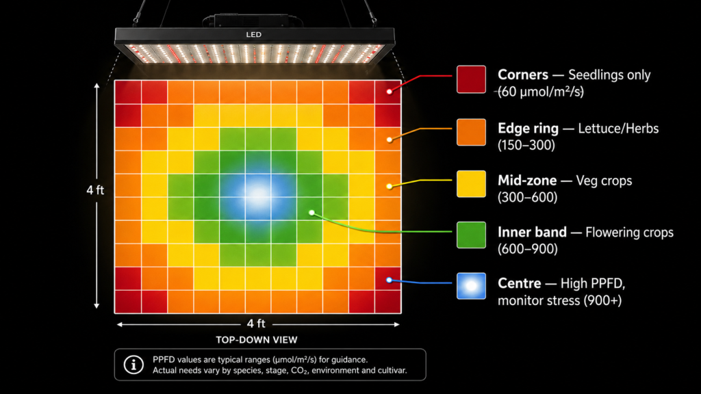
Applying this to the reference grid above:
- Corners (R1/C1, R1/C9, R9/C1, R9/C9): 60 µmol/m²/s — germination only. Place propagation trays here, not mature plants.
- Outer perimeter (Row 1, Row 9, Col 1, Col 9): 60–251 µmol/m²/s — adequate for lettuce, spinach, and microgreens at the low end of their range.
- Mid-zone ring (Rows 3–7, Cols 3–7): 431–958 µmol/m²/s — this is where your vegetative crops should live.
- Inner 3×3 (Rows 4–6, Cols 4–6): 871–1,131 µmol/m²/s — best zone for flowering and fruiting crops. Average in this zone: ~956 µmol/m²/s. Uniformity within this inner zone: 91.1% — excellent.
- Dead centre (R5/C5): 1,131 µmol/m²/s — above the typical saturation point for most crops without CO₂. Consider dimming or raising the fixture slightly if this is your only growing zone.
This reveals something important: a “poor” overall uniformity score doesn’t mean the fixture is useless. It means your effective growing zone is smaller than the full coverage area. Understanding your crop’s PPFD targets tells you which parts of the map actually work for that plant.
What Is PPFD Uniformity and Why Does It Matter?
PPFD uniformity is the ratio of minimum PPFD to average PPFD across the measured canopy area, expressed as a decimal or percentage. A higher uniformity ratio means the weakest points in the canopy are closer to the average, indicating better light balance.
Uniformity formula:
Uniformity Ratio = Minimum PPFD ÷ Average PPFD
A ratio of 0.75 or higher — where the lowest point is at least 75% of the average — is the ASABE S640 benchmark for acceptable uniformity in controlled horticulture. In controlled horticulture, a uniformity ratio above 75% is considered good, and above 85% is excellent. Poor uniformity causes uneven growth, where plants near the edges underperform compared to those in the centre.
What Causes Poor Uniformity?
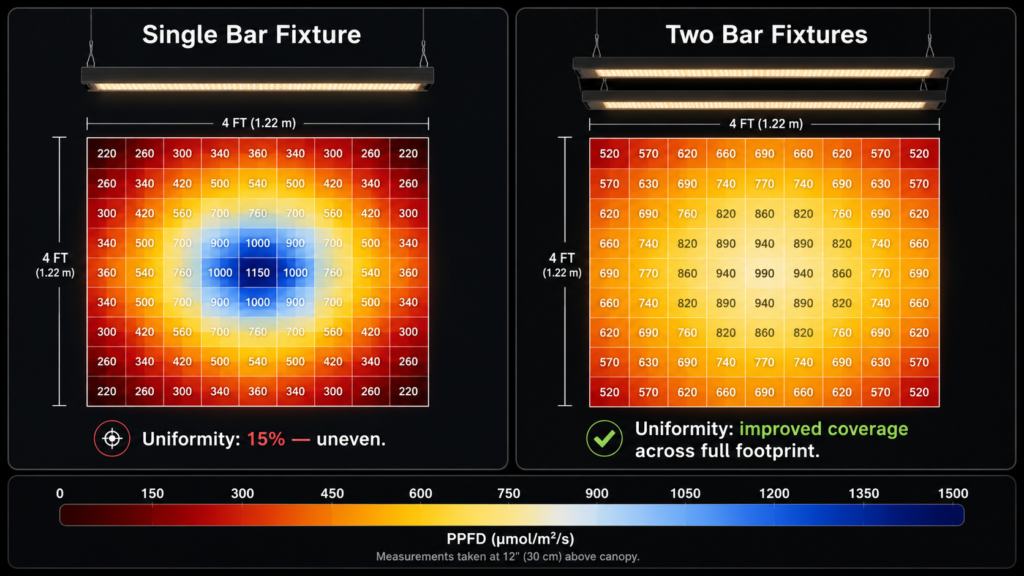
Bringing fixtures closer typically raises peak PPFD but increases edge falloff and hotspots. Raising fixtures usually lowers the average but blends beams for smoother maps. Wide beam optics and diffusers reduce hotspots and help coverage overlap; narrow beams concentrate PPFD into tighter footprints. Array spacing with overlapping distributions from multiple fixtures or bars improve uniformity; sparse layouts leave dark zones between beams.
The reference grid above illustrates this perfectly. A single bar fixture—no matter how good—concentrated over a full 4×4 area will always show a steep centre-to-edge gradient. It’s not a product defect. It’s physics.
How to Improve PPFD Uniformity
Practically, there are four levers:
- Raise the fixture—increases beam spread, reduces peak but smooths the gradient across the canopy
- Add a second fixture — overlapping coverage from two fixtures dramatically improves the edge zones that a single fixture can’t reach
- Reduce your effective canopy footprint — instead of growing across the full 4×4, concentrate plants in the inner zone where uniformity is already acceptable
- Use bar-style multi-bar fixtures — bar arrays spread light more linearly across rectangular canopies than single-point or single-board designs
How Manufacturer PPFD Maps Can Mislead You
This section matters if you’re using a manufacturer’s published PPFD map to make a buying decision — which most growers are.
The Reflective Wall Problem
Many manufacturers test their grow lights inside reflective tents or rooms, which artificially boost PPFD readings by bouncing light around the space. A test in a Mylar tent can add 15–25% to the readings compared to an open-air measurement. That inflated number goes on the spec sheet. Your grow room walls may not be Mylar. The gap between the marketed map and your real canopy reading can be significant.
The Grid Density Problem
A 3×3 grid (9 points) over a 4×4 area completely misses the corner behaviour that a 9×9 grid (81 points) reveals. Some manufacturers publish only a 3-point or 5-point reading — centre, mid, edge along one axis — which is enough to paint a flattering picture while concealing what happens at the four corners that a real crop occupies.
The Height Problem
Light obeys the inverse square law for point sources: doubling the distance from light source to canopy reduces light intensity to approximately one-quarter. Empirical PPFD maps — or accurate simulations — matter more than back-of-napkin calculations. A manufacturer’s map at 24 inches may look excellent. If you’re running your fixture at 18 inches because of tent height limitations, the peak and edge numbers shift dramatically. The map needs to match your actual setup, not the manufacturer’s ideal test condition.
What to look for in an honest PPFD map:
- Measurement height clearly stated
- Grid density of at least 5×5, ideally 9×9
- Both average and minimum values shown (not just peak)
- Test conditions disclosed (open room vs. reflective enclosure)
- Uniformity ratio calculated and stated
How to Take Your Own PPFD Map with a Quantum Sensor
If you have a quantum PAR meter — or are considering buying one — you can map your own canopy rather than trusting published data. It takes about 15 minutes and gives you information specific to your exact room, your walls, and your actual fixture position.
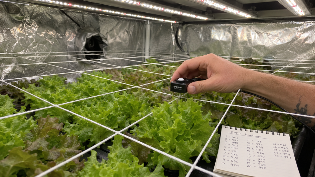
Use a calibrated quantum PAR sensor (also called a PPFD meter). Full-spectrum sensors from Apogee and LI-COR are industry standards; they’re cosine-corrected and designed for LEDs.
Step-by-step canopy mapping protocol:
- Set up your fixture at its intended operating height and intensity
- Allow the lights to warm up for 15–20 minutes before measuring
- Mark a 9-point or 25-point grid across your canopy area with tape or string
- Hold the sensor horizontally at canopy height — not angled, and not shaded
- Record a reading at each grid point, working systematically from corner to corner
- Calculate average, minimum, maximum, and the uniformity ratio (min ÷ avg)
- Map where each zone falls against your crop’s PPFD target
That map is now your personal baseline. Repeat it after any fixture height change, dimmer adjustment, or crop stage transition.
If you don’t have a quantum PAR meter, the Grow Light Calculator generates a physics-based 9×9 PPFD grid from your fixture specs and mounting height — giving you a reliable starting estimate before you invest in measurement equipment.
Using PPFD Map Data to Make Better Setup Decisions
Once you can read a PPFD map, the data starts telling you what to do rather than just what’s happening.
Scenario 1: Your average is on target but edges are under-lit
This is the most common scenario — matching the reference grid above. The fix is either raising the fixture slightly to spread the beam or concentrating your plants in the inner zone where the PPFD is appropriate for your crop. Don’t try to compensate by lowering the fixture further; that improves the edge zones slightly but pushes the centre into light stress territory.
Scenario 2: Your uniformity is good, but your average is too low
Your map is even, but your crops aren’t getting enough total light. This calls for a higher-output fixture, a longer photoperiod to increase DLI, or a smaller coverage area so the same fixture covers less space at higher density.
Scenario 3: Dead centre is too high for your crop
A 1,100+ µmol/m²/s centre reading under a fruiting crop without CO₂ enrichment risks photoinhibition. Solutions: raise the fixture to reduce peak intensity, dim to 70–80%, or use a different placement strategy that doesn’t put the most light-sensitive plants directly below the fixture midpoint.
Scenario 4: Planning a multi-fixture layout
When placing multiple fixtures, aim for 10–20% beam overlap at canopy height. Overlapping distributions from multiple fixtures or bars improve average/minimum uniformity; sparse layouts leave dark zones between beams. The goal isn’t to maximise peak PPFD — it’s to raise the floor reading (minimum) as close to the average as possible.
Shop Smart: Grow Lights with Published PPFD Maps
Before buying any LED grow light, ask for the PPFD map — not just the peak centre reading. Look for fixtures that publish a multi-point grid at stated hanging heights, with disclosed reflective conditions and both average and minimum values. Bar-style multi-bar fixtures generally produce better uniformity across rectangular canopies than single-board designs.
→ Browse grow lights with verified PPFD performance


FAQ: PPFD Maps — Grower Questions Answered
What is a good PPFD uniformity score for a grow light?
A uniformity ratio of 0.75 or higher — meaning the minimum reading is at least 75% of the average — is the ASABE S640 industry benchmark for acceptable uniformity. Above 0.85 is excellent. Below 0.6, expect visibly uneven canopy development, with edge plants consistently underperforming centre plants at the same growth stage.
Why does PPFD drop so much at the corners of my grow space?
Corner PPFD drops because light from a fixture spreads outward in a cone — and the corners of a square canopy are geometrically the furthest points from the centre of that cone. This effect follows the cosine irradiance relationship: the further a point is from directly below the fixture, and the more oblique the angle of incoming light, the less PPFD that point receives. It’s physics, not a product defect. The only real fixes are raising the fixture, adding a second fixture, or reducing the canopy footprint.
Can I trust a manufacturer’s PPFD map to plan my setup?
Use it as a starting estimate, not a guarantee. Check whether the test was done in a reflective enclosure (which inflates readings), what the grid density was (a 3×3 grid hides corner behaviour), and what height was used. The most reliable approach is to cross-check manufacturer data with your own quantum PAR meter measurements at your specific setup height, or use a physics-based calculator to model your exact conditions independently.
What does the average PPFD on a map mean for my crop?
The average PPFD represents the mean light intensity across all measured grid points — but it’s only meaningful in the context of uniformity. An average of 500 µmol/m²/s with 90% uniformity means most of your canopy is near 500. An average of 500 with 15% uniformity means some plants are getting 1,100 and others are getting 60 — and the “average” is misleading for crop planning. Always read average and uniformity together.
Does raising my fixture always improve PPFD uniformity?
Raising a fixture improves uniformity by reducing the peak-to-edge intensity gradient, but it also reduces overall average PPFD. There’s a trade-off: better spread at the cost of lower total intensity. For single-bar fixtures over large areas, raising the fixture rarely achieves the 0.75 uniformity threshold at the corners—the physics of a single-point or single-bar source mean the corners always receive less light than the centre. The most effective solution for large canopies is multiple fixtures with overlapping beams.
Read the Map, Not the Headline
A PPFD map is one of the most honest things a grow light can show you. The peak centre number is marketing. The full 9×9 grid—with average, minimum, and uniformity ratio — is data. And data is what tells you where to put your best plants, where to put your seedlings, whether you need a second fixture, and whether the manufacturer’s published specs reflect your actual grow room or a carefully arranged test chamber.
The good news is that once you know how to read a map, the decisions get simpler. You stop chasing the headline number and start working with the real distribution. Plants respond to what’s actually hitting the canopy — not what the brochure promised.
Grow With Hydroponics has built the Grow Light Calculator specifically to give you that honest 9×9 view before you make any setup decision. Run your own numbers, see where your zones fall, and grow with something solid under you.